10 Reasons Why Your Documentation is Killing Your User Experience

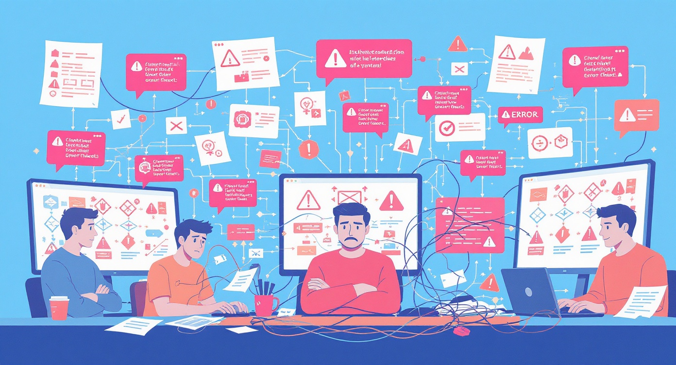
10 Reasons Why Your Documentation is Killing Your User Experience
Here's a sobering statistic: 91% of unhappy customers won't complain—they'll simply leave and never come back. Now consider this: according to Forrester Research, companies with strong documentation see 47% higher customer satisfaction scores compared to their competitors. The connection between documentation quality and user experience isn't just correlation—it's causation.
Your documentation is often the first place users turn when they encounter friction with your product. It's the silent salesperson working around the clock, the support agent who never sleeps, and frequently the deciding factor between a loyal customer and a churned one. Yet despite its critical importance, documentation remains one of the most neglected aspects of the user experience at countless organizations.
In this comprehensive guide, we'll dissect the ten most damaging documentation mistakes that are actively driving users away from your product—and provide actionable strategies to fix each one.
Key Takeaways
Quick Summary: The Documentation UX Checklist
- Context matters: Assume users need background information; don't assume prior knowledge
- Simplify language: Write at an 8th-grade reading level for maximum accessibility
- Visual content: Use screenshots, videos, and diagrams—they increase comprehension by 323%
- Navigation first: Users should find answers in under 3 clicks
- Stay current: Outdated docs are worse than no docs—update quarterly at minimum
- Examples drive adoption: Real-world use cases accelerate learning by 60%
- Brevity wins: Break content into scannable chunks under 300 words per section
- Listen to users: Feedback loops are essential for continuous improvement
- Make feedback frictionless: One-click feedback captures 4x more responses
- Accessibility is non-negotiable: WCAG compliance expands your audience by 15-20%
📥 Free Download: Documentation Audit Checklist — Use this checklist to evaluate your documentation against these 10 criteria and more.
1. You're Not Providing Enough Context
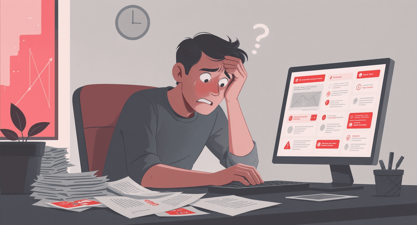
The Problem
One of the most pervasive documentation failures is the curse of knowledge—assuming that your users understand as much about your product, industry, or workflow as you do. This assumption creates documentation that feels like walking into the middle of a conversation: confusing, disorienting, and ultimately frustrating.
Research from the Nielsen Norman Group reveals that users form opinions about a page in just 0.05 seconds. If your documentation drops users into the deep end without adequate context, you've already lost them before they've read a single paragraph. They won't give you a second chance to make that first impression.
Real-World Example
Consider Stripe's API documentation, widely regarded as an industry gold standard. Instead of launching directly into endpoint specifications, Stripe begins with a conceptual overview explaining what payments processing involves, why certain steps are necessary, and how different components interact. This contextual foundation makes the technical details that follow far more digestible.
Contrast this with countless enterprise software documentation portals that assume users already understand complex workflows, acronyms, and dependencies. The result? A flood of support tickets asking basic questions that should have been answered upfront.
How to Fix It
Actionable Tips:
- Start every major section with a brief overview explaining the "why" before the "how"
- Define technical terms and acronyms on first use—or better yet, maintain a searchable glossary
- Include prerequisite sections that list what users should know or have set up before proceeding
- Use Dewstack's SmartDocs to provide AI-powered contextual answers that meet users where they are
2. Your Language is Too Technical
The Problem
Technical jargon serves a purpose among experts, but in user-facing documentation, it creates barriers that exclude the very people you're trying to help. According to a study by the American Press Institute, content written at an 8th-grade reading level achieves the highest comprehension rates—even among highly educated readers.
The statistics are stark: 55% of visitors spend less than 15 seconds on a page (Chartbeat research). If users encounter dense technical language during those crucial first seconds, they'll bounce to a competitor whose documentation speaks their language.
Real-World Example
Mailchimp revolutionized email marketing documentation by adopting a conversational, jargon-free voice. Instead of writing "Configure your SMTP relay parameters," they write "Set up your email sending settings." The meaning is identical, but the accessibility is worlds apart. This approach contributed to Mailchimp's reputation for exceptional usability and helped them grow to millions of users who might otherwise have been intimidated by email marketing complexity.
How to Fix It
Actionable Tips:
- Run your documentation through readability tools like Hemingway Editor—aim for Grade 8 or below
- Create a style guide that bans unexplained jargon and requires plain-language alternatives
- Have non-technical team members review documentation before publishing
- Use Dewstack's AI writing assistance to automatically suggest simpler alternatives to complex phrasing
- Include expandable "technical details" sections for advanced users who want deeper information
3. You're Not Using Visuals Effectively
The Problem
The human brain processes visual information 60,000 times faster than text. Yet many documentation portals remain walls of unbroken text that require tremendous cognitive effort to parse. According to research from 3M Corporation, visuals improve learning by up to 400%.
In documentation specifically, screenshots, diagrams, and video tutorials don't just supplement text—they often communicate more effectively than text ever could. Showing a user exactly where to click eliminates ambiguity that even the most precise written instructions cannot fully resolve.
Real-World Example
Notion's documentation exemplifies visual-first thinking. Every feature explanation includes annotated screenshots showing exactly what the interface looks like, where relevant buttons are located, and what users should expect to see. Their animated GIFs demonstrating drag-and-drop functionality communicate in seconds what would require paragraphs of text to explain.
Gartner research indicates that documentation with relevant visuals sees 323% better comprehension rates compared to text-only alternatives. This isn't a marginal improvement—it's a transformation in how effectively your documentation communicates.
How to Fix It
Actionable Tips:
- Include at least one relevant screenshot or diagram for every procedural section
- Use annotations (arrows, highlights, numbered callouts) to direct attention to key interface elements
- Create short video tutorials for complex multi-step processes—keep them under 2 minutes
- Leverage Dewstack's browser extension to capture screenshots and workflows automatically as you demonstrate procedures
- Ensure visuals are updated whenever the UI changes—outdated screenshots are worse than no visuals
4. Your Documentation is Hard to Navigate
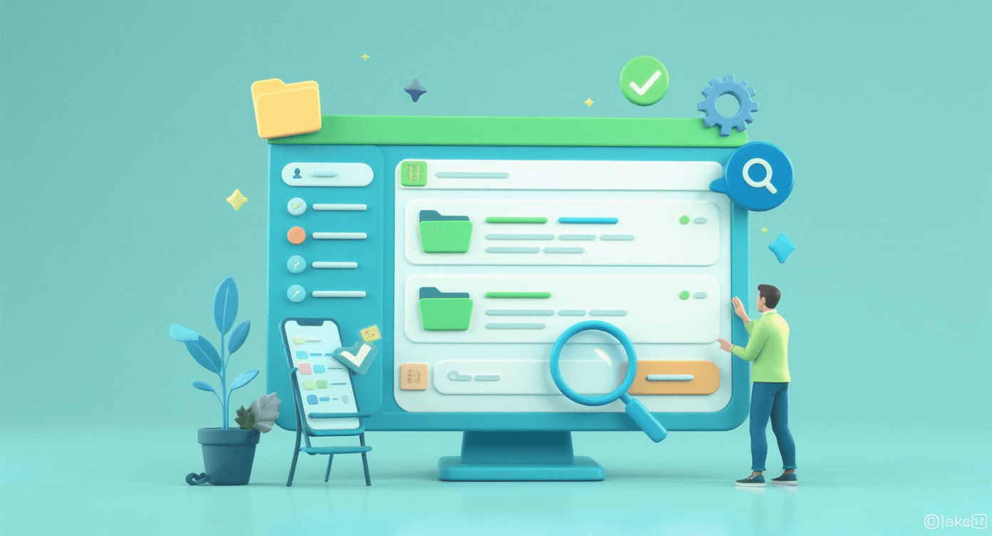
The Problem
Users don't read documentation—they search it. They arrive with a specific question and need to find the answer immediately. If your documentation structure forces users to hunt through multiple pages, scroll through irrelevant content, or guess which section might contain their answer, you've already failed them.
Nielsen Norman Group research shows that users typically give up on finding information after just 3 clicks. Beyond that threshold, frustration takes over and they abandon the documentation entirely—often abandoning your product along with it.
Real-World Example
Twilio restructured their entire documentation portal after discovering through analytics that users were spending an average of 4.2 minutes trying to find relevant information. By implementing a powerful search function, logical category hierarchies, and contextual "related articles" suggestions, they reduced that time to under 45 seconds. Support ticket volume dropped by 32% in the following quarter.
How to Fix It
Actionable Tips:
- Implement robust search functionality that handles natural language queries and typos
- Create a logical information architecture with no more than 3 levels of hierarchy
- Include prominent navigation breadcrumbs so users always know where they are
- Add "related articles" sections to guide users to adjacent relevant content
- Use Dewstack's analytics to identify which pages users search for most frequently and ensure they're easily accessible
- Consider implementing AI-powered search that understands user intent, not just keywords
5. Your Documentation is Out of Date
The Problem
Outdated documentation isn't just unhelpful—it's actively harmful. When users follow instructions that reference outdated interfaces, deprecated features, or changed workflows, they experience a special kind of frustration: they did everything right, but the documentation lied to them.
According to a study by SDL, 90% of customers consider accurate content essential to their overall experience, and outdated documentation is the fastest way to destroy that trust. Once users discover that your documentation can't be relied upon, they stop consulting it entirely—and start flooding your support channels instead.
Real-World Example
A prominent project management SaaS company failed to update their documentation after a major UI redesign. For three months, their getting-started guide referenced buttons and menu items that no longer existed. Customer onboarding completion rates dropped by 41%, and their NPS score fell by 23 points. The documentation debt took six months to fully remediate, and customer trust took even longer to rebuild.
How to Fix It
Actionable Tips:
- Establish a quarterly documentation review cycle tied to product release schedules
- Assign clear ownership for each documentation section—unowned docs inevitably decay
- Implement version tracking so users can see when content was last updated
- Use Dewstack's content management system to flag documentation that hasn't been reviewed within your freshness threshold
- Create automated alerts when product changes might impact existing documentation
- Read our guide on keeping documentation current for detailed strategies
6. You're Not Providing Enough Examples
The Problem
Abstract explanations tell users what something does; examples show them how to actually use it. According to research from the Journal of Technical Writing, documentation that includes worked examples improves task completion rates by 60% compared to conceptual explanations alone.
Users don't just want to understand your product theoretically—they want to see it solving problems similar to their own. Without examples, you're asking users to make cognitive leaps from concept to application, and many will fall into the gap.
Real-World Example
Stripe's documentation includes code examples in multiple programming languages for every API endpoint, along with detailed tutorials showing complete implementation scenarios. Their "Recipes" section provides end-to-end examples for common use cases like subscription billing, marketplace payments, and invoicing. This example-rich approach has made Stripe's documentation a benchmark that developers actively recommend to each other.
How to Fix It
Actionable Tips:
- Include at least one concrete example for every feature or workflow you document
- Show examples for multiple use cases—your users have diverse needs
- Use realistic data in examples, not obviously fake placeholders
- For API documentation, provide copy-pasteable code snippets that actually work
- Include "before and after" examples showing the transformation your feature enables
- Leverage Dewstack's template library for example-driven documentation structures that guide you toward example-rich content
7. Your Documentation is Too Long
The Problem
More documentation isn't better documentation. Dense, lengthy articles overwhelm users and bury the specific information they need under mountains of tangentially related content. Research from the Poynter Institute shows that online readers scan content in an F-pattern, focusing on the first few words of each paragraph and largely ignoring the rest.
Remember: 55% of visitors spend less than 15 seconds on a page. Your documentation must deliver value within that window or lose the user entirely.
Real-World Example
Basecamp (formerly 37signals) famously embraces brevity in all their communications, including documentation. Their help articles rarely exceed 300 words, focusing laser-like on answering one specific question per article. This approach aligns with their product philosophy of simplicity and has earned their documentation a reputation for being refreshingly easy to use.
How to Fix It
Actionable Tips:
- Break long articles into multiple focused pieces—each addressing one specific question
- Use the "inverted pyramid" structure: most important information first
- Include a TL;DR summary at the top of longer articles
- Employ formatting—headers, bullet points, numbered lists—to aid scanning
- Set a soft limit of 300 words per section and 1,000 words per article
- Use Dewstack's content organization features to break lengthy documentation into logical, digestible modules
- Learn more about effective documentation structure in our content architecture guide
8. You're Not Addressing User Feedback
The Problem
Your users encounter documentation problems every day, and they're trying to tell you about them—through support tickets, social media comments, community forums, and direct feedback. If you're not systematically collecting and acting on this feedback, you're flying blind while your users navigate a minefield.
Forrester Research found that companies who actively incorporate customer feedback into their documentation see 47% higher customer satisfaction scores. The insight your users provide is irreplaceable—they experience your documentation's failures in ways your internal team cannot.
Real-World Example
Atlassian transformed their Confluence documentation by implementing a systematic feedback loop. Every documentation page includes a prominent rating system and feedback form. A dedicated team reviews this feedback weekly, prioritizing updates based on user pain points rather than internal assumptions. The result? A 35% reduction in documentation-related support tickets and significantly improved user satisfaction scores.
How to Fix It
Actionable Tips:
- Review support tickets weekly to identify documentation gaps and confusing sections
- Monitor community forums and social media for documentation-related complaints
- Create a direct channel for documentation feedback on every page
- Prioritize documentation updates based on the frequency and severity of user-reported issues
- Use Dewstack's integrated analytics and feedback tools to track which documentation pages generate the most confusion
- Close the loop by notifying users when their feedback leads to improvements
9. You're Not Making It Easy to Give Feedback
The Problem
Even users who want to help improve your documentation will abandon the effort if providing feedback requires too much friction. Lengthy feedback forms, required email addresses, multi-step processes—each additional barrier reduces participation exponentially.
According to a study by CustomerThermometer, one-click feedback mechanisms capture 4x more responses than traditional feedback forms. If you want meaningful volume of user input, you must make contributing feedback as effortless as possible.
Real-World Example
GitHub's documentation includes a simple "Was this page helpful?" prompt with thumbs up/down buttons. Users can provide instant feedback with a single click, and those who want to provide more detail can optionally add comments. This frictionless approach generates thousands of data points per month, enabling GitHub to continuously identify and address documentation problems.
How to Fix It
Actionable Tips:
- Implement one-click feedback mechanisms (helpful/not helpful) on every page
- Don't require login or personal information for basic feedback
- Provide optional (not mandatory) fields for detailed comments
- Acknowledge feedback immediately—users should know their input was received
- Use Dewstack's built-in feedback widgets that capture user sentiment without interrupting their workflow
- Regularly communicate documentation improvements driven by user feedback to encourage continued participation
10. Your Documentation is Not Accessible
The Problem
Accessibility isn't optional—it's a legal requirement in many jurisdictions and an ethical imperative everywhere. According to the World Health Organization, approximately 15% of the global population lives with some form of disability. When your documentation isn't accessible, you're excluding a significant portion of your potential users.
Beyond the ethical considerations, accessible documentation simply works better for everyone. Clear headings, adequate color contrast, descriptive alt text, and logical structure improve usability for all users, not just those with disabilities.
Real-World Example
Microsoft's documentation team committed to WCAG 2.1 AA compliance across all their documentation properties. This investment required meaningful effort—auditing thousands of pages, rewriting unclear content, adding alt text to images, and fixing navigation issues. The result extended beyond accessibility: overall documentation usability scores improved by 28% for all users, demonstrating that accessible design benefits everyone.
How to Fix It
Actionable Tips:
- Audit your documentation against WCAG 2.1 guidelines—numerous free tools exist
- Ensure all images include descriptive alt text that conveys the same information as the visual
- Use proper heading hierarchy (H1, H2, H3) to enable screen reader navigation
- Maintain sufficient color contrast ratios for text readability
- Enable keyboard navigation throughout your documentation site
- Provide transcripts for video content and captions for audio
- Use Dewstack's accessibility-first templates that build WCAG compliance into your documentation from the start
- Test your documentation with actual assistive technologies, not just automated checkers
The Cost of Documentation Neglect
The consequences of poor documentation extend far beyond user frustration. Consider the cascading business impacts:
Support costs escalate: Each documentation failure generates support tickets. At an average cost of $15-25 per ticket (according to HDI Research), documentation problems quickly become expensive.
Churn accelerates: Users who can't figure out how to use your product leave. Given that acquiring a new customer costs 5-25x more than retaining an existing one (Harvard Business Review), documentation-driven churn is devastatingly expensive.
Product adoption stalls: Features that aren't well-documented might as well not exist. Users who can't discover and understand your product's capabilities underutilize what they've paid for—and question whether to continue paying.
Brand reputation suffers: In an era of social media and review sites, poor documentation becomes public knowledge quickly. Negative reviews mentioning confusing documentation dissuade potential customers before they ever try your product.
Conclusion
Creating exceptional documentation isn't about perfection—it's about continuous improvement driven by user needs. Each of the ten issues we've explored represents an opportunity to transform your documentation from a liability into a competitive advantage.
Start by auditing your current documentation against these ten criteria. Identify the most severe gaps—likely navigation, outdated content, or lack of visuals—and address those first. Implement feedback mechanisms to surface problems you haven't yet discovered. And commit to treating documentation as a living product that requires ongoing investment, not a one-time project.
Remember: 91% of unhappy customers won't complain, they just leave. Your documentation is often their last touchpoint before making that decision. Make it count.
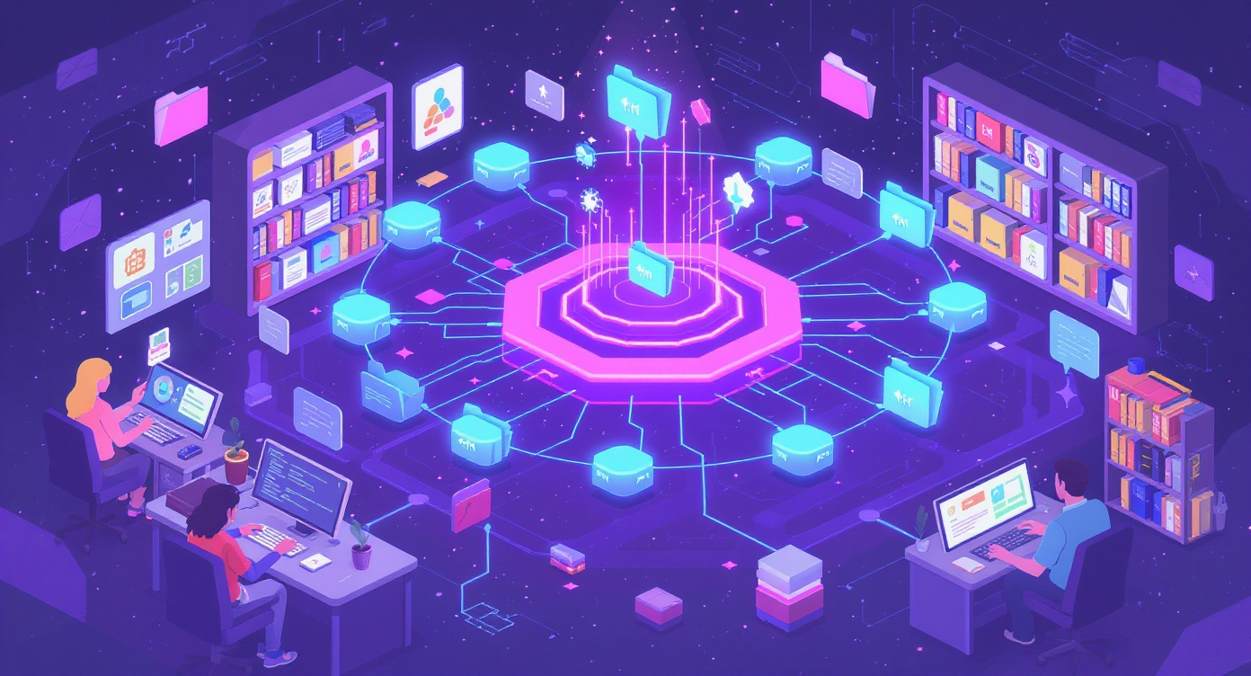
Fix Your Documentation with Dewstack
Ready to transform your documentation from a liability into an asset? Dewstack gives you everything you need to create documentation that actually enhances the user experience.
Stop documenting from memory: Dewstack's browser extension captures procedures, screenshots, and workflows as you work. Build documentation that reflects how your product actually works—not how you remember it working.
AI that actually helps users: SmartDocs understands your content and delivers instant, relevant answers to user questions. No more endless scrolling through outdated FAQs. Users get help in seconds, not minutes.
Fix the fragmentation: Import scattered documentation from anywhere—Word, Google Docs, PDFs, Confluence, Notion. Dewstack unifies everything into one organized, searchable experience with consistent formatting and navigation.
Measure what matters: Built-in analytics show exactly where users struggle with your documentation. Identify gaps, track search patterns, and continuously improve based on real user behavior. Custom domains and branding create a polished experience that matches your product.
Your documentation doesn't have to kill your UX. Try Dewstack for free and see how intelligent documentation can transform your user experience.
Looking for more documentation best practices? Explore our guides on documentation information architecture, writing effective API documentation, and measuring documentation success.
Ready to Elevate Your Documentation?
Try Dewstack free for 3 days. Create AI-powered documentation that answers questions instantly.
Start a free trialANSWERS TO
Frequently Asked Questions
Here are some common questions that might provide the information you're seeking.
Related Blogs
A Comprehensive Guide to Creating and Managing Effective Documentation for Your Knowledge Base
Learn how to create and manage knowledge base documentation that reduces support costs by up to 50%. Discover proven strategies, real-world examples, and expert tips for building documentation that users actually use.

Effective SOPs in Technology - A Comprehensive Guide
Learn how leading technology companies create and implement effective Standard Operating Procedures (SOPs) for DevOps, incident management, IT operations, and software deployment to streamline workflows and maximize team efficiency.

Revolutionize Your Documentation with the Ultimate Import Tool
Learn how to overcome documentation fragmentation, migrate content effectively, and build a unified knowledge base. Complete guide with migration strategies, platform comparisons, and best practices.
Ready to get started with Dewstack?
Try Dewstack free for 3 days. Create AI-powered documentation that answers questions instantly.
Card required, not charged during trial.